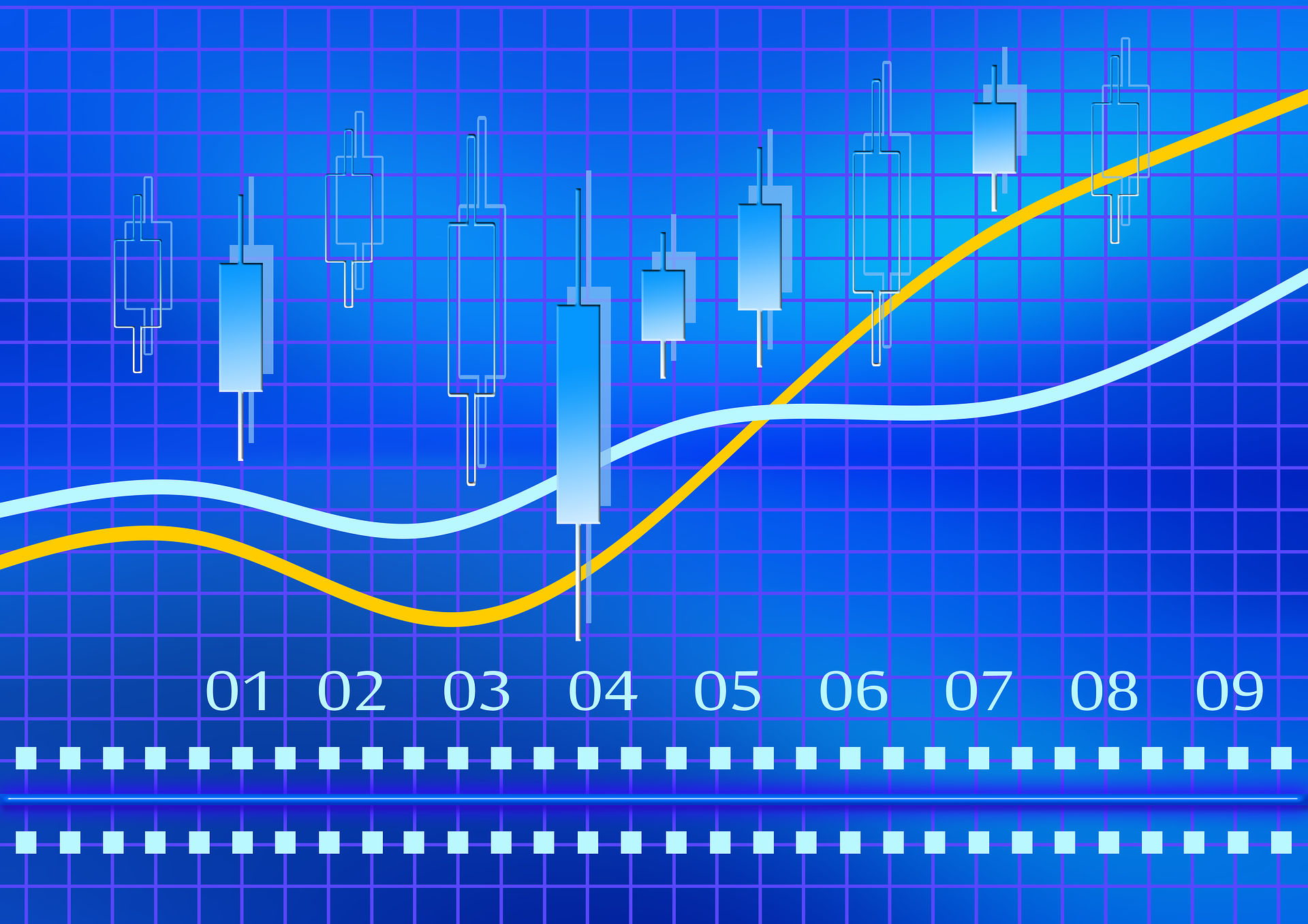
CHARTING METHODS – TRACKING THE MOVEMENTS
adminVik
- posted on
- No Comment
Price charting methods are used to show the movement of a financial instrument over a period of time. The bottom axis defines the timeframe. It can vary from a single tick (the minimum upward or downward movement in price) to hourly, daily, or even yearly timeframes.
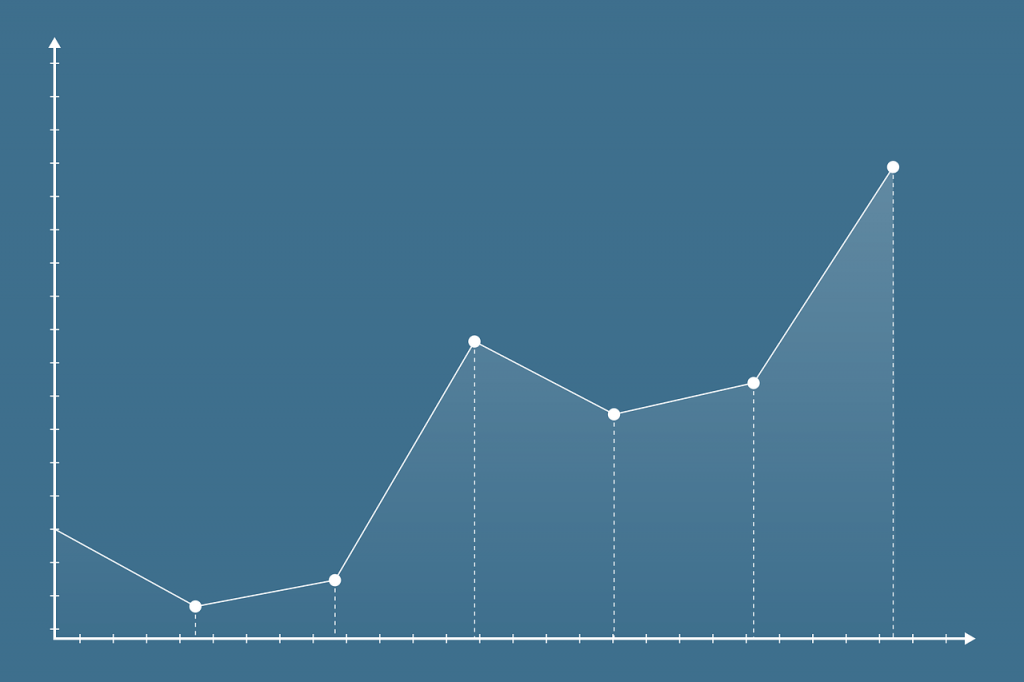
The line chart is the most basic form of charting methods. This shows nothing more than just the closing price of the instrument at the end of each period. So, if we are looking at a one-hour timeframe chart, the line will just plot the closing price at the end of each hour.
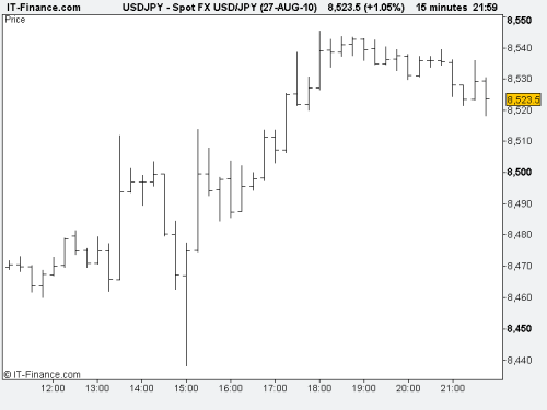
The bar charting method will display more information than this. For each period a bar line will be plotted. The top of the bar will show the highest level that price reached within the selected period. The bottom of the bar will show the lowest. A marker on the left shows the opening price, and a marker on the right shows the closing price. This allows us to see not only where price ended up at the close of the period, but also the key aspects of the movements it went through to get there.
Now that you understand how to track movements, the next step is understanding the market trends and how to read them.